For more details on registrations and submissions for the Fundamentals of Data Visualization and Storytelling, please first login to your account. If you do not have an account then you can create one below:
Please note: registration is now closed. You can still create an account for future updates.
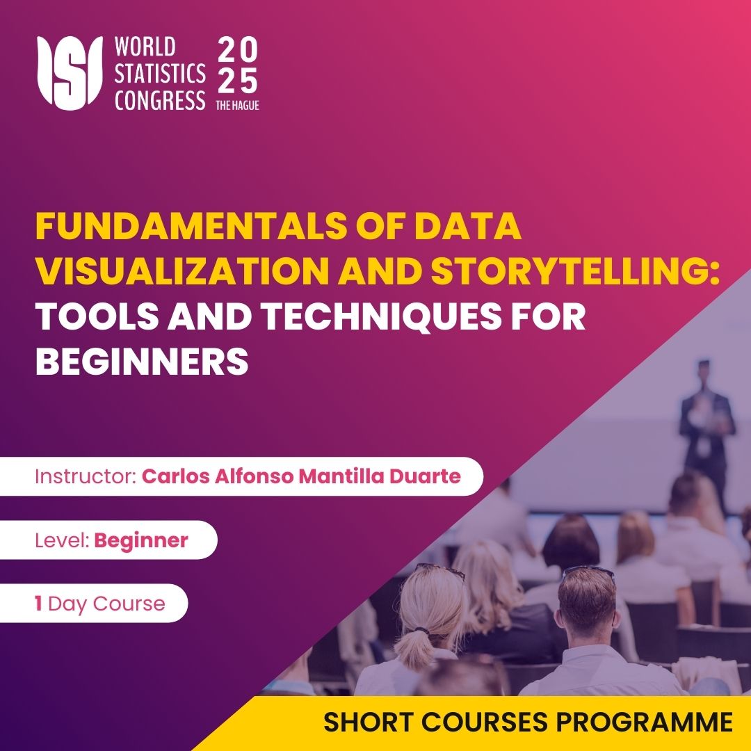
Login to your account Create accountThis course provides a hands-on introduction to data visualization and storytelling fundamentals. Through a practical approach, students will learn to transform data into effective visualizations by combining accessible tools (such as Power BI, R, Python, and GIS) and fundamental design principles, including color theory and typography. This course is designed for undergraduate students from any area of study who have a basic knowledge of statistics and wish to enhance their ability to communicate data effectively.

Carlos Alfonso Mantilla Duarte is a Ph.D. candidate in Mathematical and Applied Statistics at the University of Granada and holds a Master’s in Applied Statistics. He is currently a professor at Universidad Industrial de Santander, where he has taught courses in statistics and econometrics, with a strong interest in data visualization and spatio-temporal models. With extensive experience in applied research, he has contributed to numerous publications and presentations at international conferences. His areas of expertise include spatial statistics, Bayesian analysis, and data modeling.
Affiliation: Universidad Industrial de Santander
Participants will
Graduate and undergraduate students from any field who have a basic knowledge of statistics and an interest in data analysis and effective communication.
Leiden University, Wijnhaven campus
Turfmarkt 99, 2511 DP The Hague
Open in Google Maps
From The Hague Central Station
From Centrum The Hague (Binnenhof / Grote Markt)
From World Forum The Hague
We have placed cookies on your device to help make this website better.
You can change your cookie settings in your web browser. Otherwise, we’ll assume you’re OK to continue.
Some of the cookies we use are essential for the site to work.
We also use some non-essential cookies to collect information for making reports and to help us improve the site. The cookies collect information in an anonymous form.
To control third party cookies, you can also adjust your browser settings.
Do Not Accept Third Party Cookies